Table of Contents The Trap of the “Same Old” The Way it’s Always Been Done Blues Starting Off On The Right Foot Talking Strategy with McQuillen Creative Group Why Would You Need A Brand Audit Have you been able to align your brand across your workers, management, and customers? If it’s not, you may be wasting ad dollars. In another way, have you also felt like your brand lacks a certain ‘oomph?’ Lastly, if it… Read more »
3 Critical Things to Know About Product Packaging
Table of Contents The Importance of Identity Design Components of Designing Product Packaging Creating a Hierarchy of Information What Product Packaging Means for You If you’re selling something, your product packaging should get people excited to try or buy your stuff. If it’s bland, then you might need some help. There is tons of work that goes into designing packages that people can’t help but pick up. So we will cover three areas… Read more »
Got a Big Printing Project? 3 Costly Mishaps to Avoid
Printing projects can be easy to screw up if you miss the details… We understand that outside of basic office printing, it can feel daunting to work on a major printing project. For us, we work closely with clients and printing companies to make sure everything is accurate. But maybe you’re the DIY type of business owner. While there are lots of things to keep track of during a print job, you should remember the… Read more »
Country Legends Jukebox
MCG Logo Development Overview Country Legends Jukebox is a radio program that was started by longtime radio host Jay Dean. It hit the airwaves as a show playing classic country hits. Jay came to McQuillen Creative Group to get a logo that reflected the classic country feel that his show celebrated. I begin the logo design process by taking some time to research the country music radio industry, which was incredibly useful in this situation… Read more »
Sand Creek Animal Clinic
Logo Design for Sand Creek Animal Clinic Sand Creek Animal Clinic is located near a sandy creek outside of Woonsocket, SD. They are known for horse care, primarily for competitive sport horses like barrel racing, rodeos, roping, showing, etc. But they also service a lot of cattle and also will look at any small pet.They came to us to create a logo and give them the identity they needed. First, I took time to learn more about the client’s… Read more »
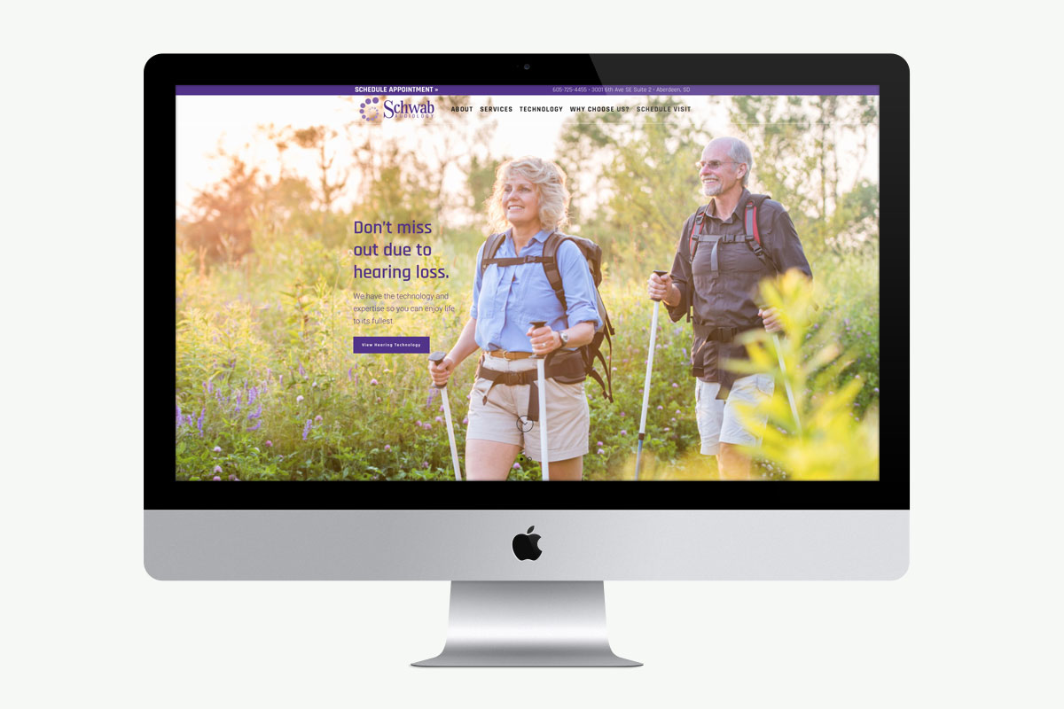
Schwab Audiology Brand Development
We recently had the pleasure of creating the brand for Schwab Audiology. As a native of Aberdeen, Dr. Elizabeth Falk Schwab returned to the area to open her own hearing healthcare clinic. Elizabeth brought us on board to help with designing her logo, stationery items, and print advertising as well as developing her website. Schwab Audiology Brand Development in Review When creating the logo, it was important that I avoided the “easy option” of using an ear as the symbol. Instead, I… Read more »
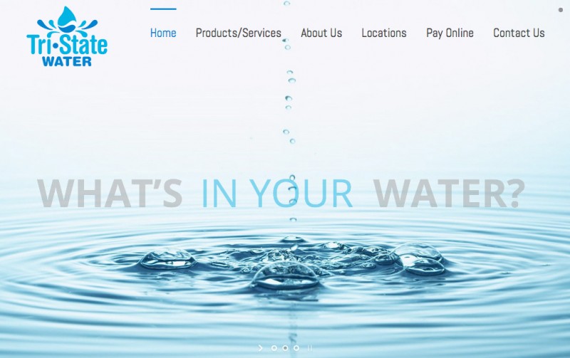
Established Brand Reemerges with a Splash • Tri-State Water
Based in Northeast South Dakota, Tri-State Water was established in 1986. After getting great use out of their original brand image, they recently decided to modernize it in an effort to rebrand and reposition themselves in a growing and competitive market. As both our friends and office-water suppliers, Tri-State recently hired us for this exciting change! We developed a new logo, overhauled their website, and wrote a press release. The new site officially launched on 10/8/14. We met with Tri-State… Read more »
Helping Out Aberdeen’s Finest
This was one of the coolest projects I’ve had the privilege of designing. I was approached by the Aberdeen Police Department to design their new shoulder patch for their uniforms. They had originally wanted typical Aberdeen things, pheasants, wheat, South Dakota state shape, etc. After a few attempts we agreed on some more iconic, Aberdeen-specific items. They had a catalog in which they could just order designs from, but we really wanted to make it… Read more »
