The proper right-hand curly apostrophe is the go-to mark when making contractions or indicating possession. For the most part, all of our software can produce the proper curled apostrophe when that key is typed. However, often when text is copied and pasted between programs, the apostrophe often gets converted to a “tick” mark or a mere vertical stroke. Unfortunately, few know the difference. In fact, this tick mark has become so prevalent in all media that the curly version has seemed to have been forgotten. We see the tick marks in quotation marks as well. But we’ll concentrate on the apostrophe.
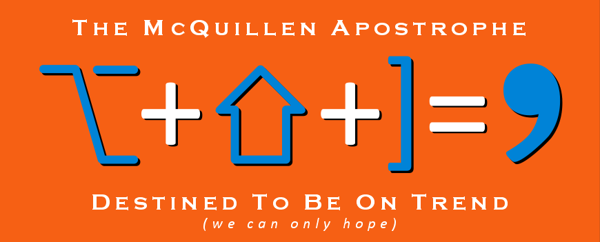
There has been much discussion lately about the Oxford Comma. The Oxford Comma? Does a comma have a specific name? So then why can’t the right-hand curly apostrophe also have a name? Since it seems to be forgotten, perhaps by putting a name on it, something like the McQuillen Apostrophe, the right-hand curly apostrophe can become a bit more popular as it can now be referred to with a proper name. Eh, it’s worth a shot.
Why bother? In essence, it’s always been the mantra at McQuillen Creative that if there is something worth doing, it’s worth doing right. And the tick mark just isn’t right. Here is exactly what we’re referring to:
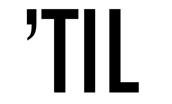
You’ll notice that the right-hand curly apostrophe on the right is used to indicate missing letters. That’s what a contraction is after all. As mentioned above, most all publishing software will type the proper mark when the apostrophe key is struck. In fact, check your preferences for each application. If you have a “character” or “typography” preference category, look for a preference called, “use curly quotes,” or “smart quotes.” But, when you try to type jargony words like ’til, as a truncated version of “until”, your program will instead produce a left-hand curly apostrophe because it thinks you want a quote mark since it’s at the start of a word. It should be a right-hand version because it is representing missing letters, like a contraction. Most everyone gets this wrong. In fact, you see it on magazine covers and a lot of TV graphics. Case in point, Fargo Magazine erred recently.

 Compare the ’TIL on the left, with the proper right-hand curly apostrophe on the right. So how do you convince your graphics program to type the proper right-hand curly apostrophe? You have to use the manual override which is oddly enough, three separate keys; and none of them make sense, nor does it even involve the apostrophe key. So here it is, for Mac, hold option, shift and right bracket. This will produce the proper apostrophe for the beginning of a truncated word.
So please us the McQuillen Apostrophe. Your typography will look a lot better, and at least you’ll know you’re doing it right, despite the tick mark which is on trend – in a bad way. I see a lot of recent college and trade school grads producing improper apostrophes and quotation marks in their portfolios. This can only mean that the art of typography isn’t really stressed in graphic design education.
And watch for the tick marks. Once you spot them, they will bug you forever, if you happen to be a perfectionist. But if you’re in the graphic design industry, you probably are a perfectionist.
Please type responsibly. — Troy McQuillen, McQuillen Creative Group
Contact McQuillen Creative
McQuillen Creative has been in the marketing game for over 25 years and we want to help your business. Do you need help with your marketing? We offer services that scale with the needs of our clients. GIVE US A CALL and let’s see how we can create a strategy for your social media presence.
McQuillen Creative Group, Inc | 423 S Main St, Suite 1
Aberdeen, SD 57401 | 605.226.3481 | MCQUILLENCREATIVE.COM | MCQUILLEN CREATIVE ON FACEBOOK
